Функции
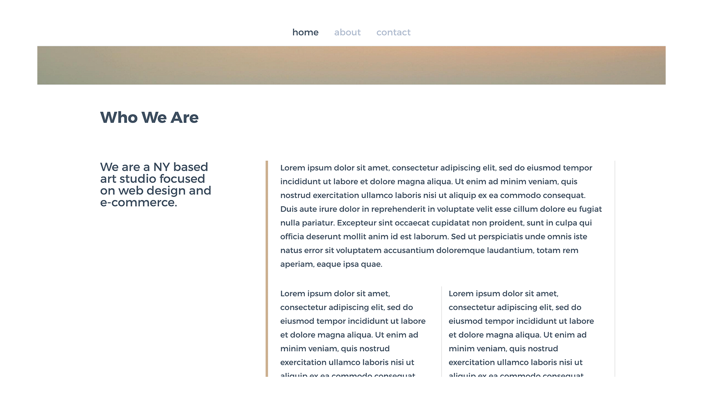
checkAdd a vertical divider to your Weebly columns.
check
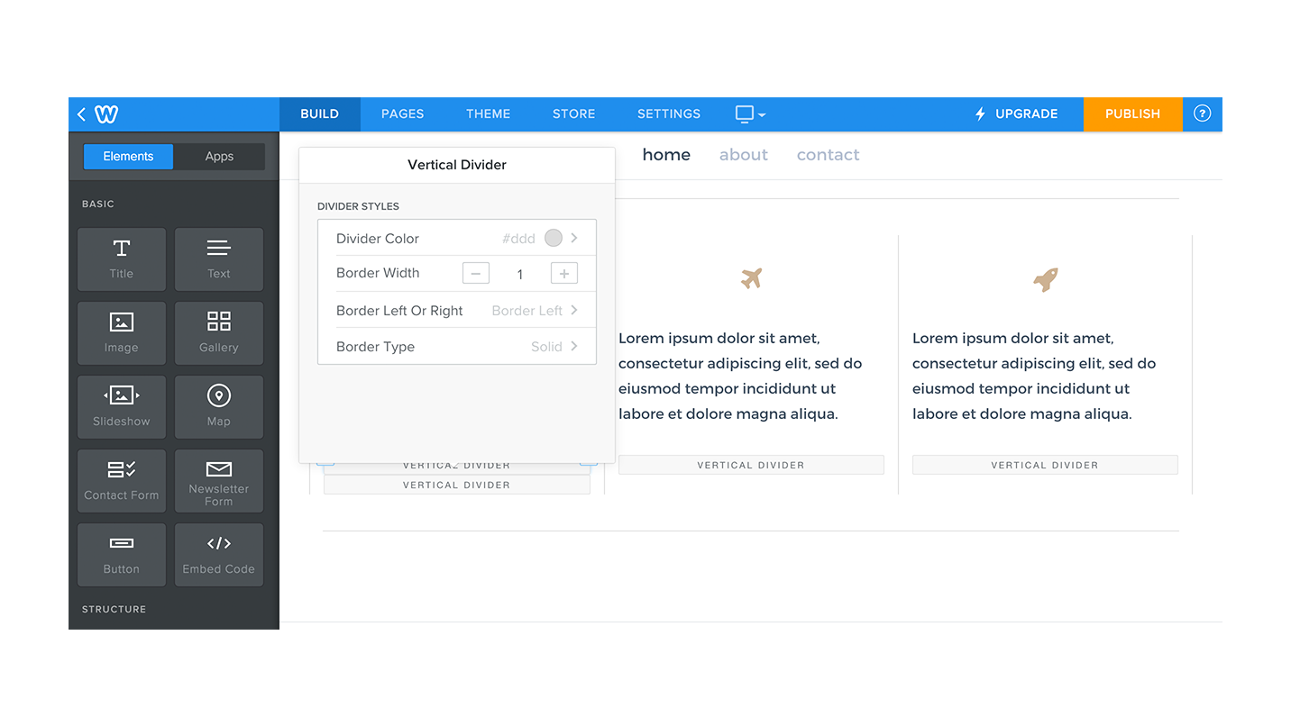
Define thickness, style and color for your divider.
check
Hide for mobile devices or turn into a horizontal divider. (define your own breakpoint)
О нас
Vertical divider will give you a border on the left or right of the parent column it is located in.
This element requires to be added inside an existing column created on Weebly.
The border/divider gets removed when screen size goes under 767px and columns become blocks (default Weebly responsive behavior). You can specify your own breakpoint, of screen width, on which the divider should be shown as a horizontal divider.
Options are:
For more awesome elements, please visit: Waddons
This element requires to be added inside an existing column created on Weebly.
The border/divider gets removed when screen size goes under 767px and columns become blocks (default Weebly responsive behavior). You can specify your own breakpoint, of screen width, on which the divider should be shown as a horizontal divider.
Options are:
- Set Border color
- Border thickness
- Border type (solid - dashed - dotted)
- Border on the left or right of column
- Specify the breakpoint for responsive displays.
For more awesome elements, please visit: Waddons
Pricing
PRO
$0
$0
Add vertical divider
Style your vertical divider width and color.
Style your vertical divider width and color.
check
Responsive design
Set the trigger width for responsive designs, and select wether the divider should be located at the bottom, top or simply hidden.
Set the trigger width for responsive designs, and select wether the divider should be located at the bottom, top or simply hidden.
check
Отзывы
-
Sarah Tan Jul 24, 2024works just as advertised! thank you :) also, since i noticed quite a few bad reviews from people not knowing how to use this: drag the divider onto your page, click onto the box that says "vertical divider", scroll down and there should be a button indicating a tutorial which will show you how to use it :)
-
Пользователь Weebly Jul 07, 2023Absolutely, 100% worthless. Save yourself the trouble of having to figure out how to delete it.
-
Laci Peterson Apr 04, 2023Follow the instructions and it works perfectly. Not really a vertical divider, but a border. Works all the same for my purposes.
-
Gavin O'Neill Dec 13, 2022This is a great app. Very intuitive. Obviously you should watch the tutorial. The responsive option is great for playing around with how your site looks on mobile screens. It was exactly what I was looking for and free! Thanks!!!
-
Beverley Rutland-Manners Jul 29, 2022I think this could be a handy little App, but I'd like to see a means of changing colors and thicknesses of the divider. Until this happens I choose other ways to separate content blocks, that give me more options.
-
Jerome Haden Sep 04, 2021BAMBOO REFUSES TO GIVE ME A REFUND AFTER 3 DAYS OF 7 DAY TRIAL PERIOD
-
Пользователь Weebly Jul 28, 2021Die App ist OK, in Sitebuilder 2 aber eigentlich überflüssig. Pedro
-
Roger Alderson Apr 23, 2021It's a good little addition to the weebly build modules and very easy to use. It has one (minor) irritant. It takes up a little space in a column. So, if you add it below text in a column, then the divider line extends slightly further than the text. It's a not a deal breaker, but it does mean that you have to mess around with spacers at the top of the text to try to 'balance' everything. It means that it isn't really completely 'plug n play' and will require some additional formatting when used. Overall, I like it.
-
Marta Stachowiak Jan 08, 2021It works perfectly, just please take 30 sec to see the tutorial. Thank you devs for making this little free alternative to weebly's horizontal-only divider ♥
-
David Sanya Dec 31, 2020Its a actually a decent app, just gotta be patient and read the tutorials lol
1–10 из 185


